![]() All content of this site is Copyright © 1996-2009 Kevin Pease. All images are for viewing only and may not be used without permission.
All content of this site is Copyright © 1996-2009 Kevin Pease. All images are for viewing only and may not be used without permission.
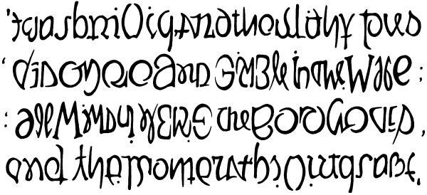 The first verse of Jabberwocky by Lewis Carroll. It is also the last verse, which means I could go on to finish the whole thing if I am ever crazy enough. As the poem is full of gibberish to begin with, one would expect legibility to be a particularly heavy problem, and, of course, it's a large block of text, so style is hard to keep consistent. However, these problems seem to balance each other out somewhat, in that all these wildly forced letterforms take on the appearance of archaic runes, the dot-spattered scrawly style of which seems appropriate for Jabberwocky in a way that would not seem so appropriate for, say, the Gettysburg Address. I took advantage of coinciding word breaks when I could, but the gaps must be very subtle, or the remaining places where words must run together wouldn't hold up. Another way of marking the beginnings of words is to make a letter big if it begins words going both ways. One learns very quickly that every double letter, especially a double L, is a bullet to be dodged. You can't just take any two things that might individually look like an L and put them next to each other; they have to be very similar or legibility is completely lost. A part I am particularly proud of is how the consistently shaped O's of BOROGOVES reinforce the identity and meaning (such as it has) of GYRE. |