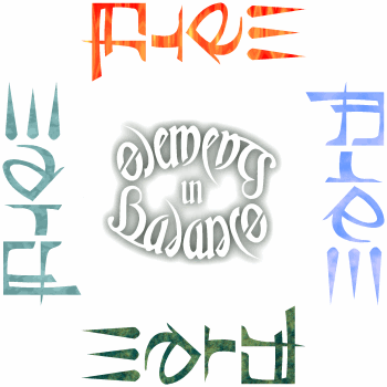
An ambigram that reads differently from each of four directions.
 
Not long after I found myself wondering if this
could be done, I found I had done it. It came to life as if by magic. To begin, I decided which words would go which way
by lining up the obvious E/E/W, and found that A/A/R/R also lined up nicely, so that a simple A/R
inversion tilted 45 degrees
would work just fine. For the short word AIR, E/E/W became a very appropriate embellishment of upward motion lines.
R/I/I/T was simple enough, but required careful shaping in the final design so that the I in
AIR would not look too much like an L. The real work, of course, was that complex squarish glyph.
Noting the verticals of H and the horizontals of E, I wove the letters together
until I had a TH that became ER sideways, each letter being the top or bottom half of the other pair.
I turned it further and found that I could make an ornate F from this by stretching out a descender. I turned it
once more, and found that A had more or less taken care of itself!
The great thing about this is how the same shape is evocative of each subject in turn. E of WATER seems
like the surface of a calm pond. Those same lines become like shoots of
vegetation springing from the soil in EARTH. The ornate F of FIRE evokes hot
dripping wax, while the A of AIR is very winglike. All from the same shape. Of course, at the other end of
the word, the raindrop shapes become leaves, flames, and the aforementioned jetstreams.
|
![]() All content of this site is Copyright © 1996-2009 Kevin Pease. All images are for viewing only and may not be used without permission.
All content of this site is Copyright © 1996-2009 Kevin Pease. All images are for viewing only and may not be used without permission.